NOT ONE THING. ONE THING AT A TIME.
One craft at a time, twenty years running. Currently: design systems built for people first — accessible enough that AI agents read them too.
Turning a legal deadline into an AI-ready design system
Permalink to this case study →In addition to my product-team duties, I've functioned as Swappie's principal-level designer: I led the European Accessibility Act response end to end — audit, remediation roadmap, legal sign-off, company-wide training — and used that mandate, alongside a brand refresh, to rebuild the design system on an accessible foundation and ship the AI-agent infrastructure now used company-wide.
EAA / WCAG 2.2 AA compliance program
Audited 26 views across the full purchase, sell, and account flows — keyboard, screen reader, 200% zoom, and automated testing — then built an 11-topic prioritized remediation roadmap and aligned the compliance position with legal ahead of the EAA's June 2025 in-force date. Delivered a company-wide training covering engineering, legal, and marketing.
AI-agent design infrastructure
Built the pipeline connecting design-system tokens straight to generated code, so AI agents read and edit against the live system — now used across multiple product launches. Design changes now ship as reviewed, agent-authored pull requests, with zero incidents across the rollout.
Design system rebuilt as the vehicle for both
Rather than retrofitting fixes, used the compliance deadline as the occasion to rebuild the Swappie Design System on a modern accessible foundation and drove its migration into Storybook — moving it from Figma-only to a system that exists in code.
EAA fine risk mitigated
Lighthouse score
Trade-in entries
“Jukka has already ensured that Swappie is ahead of the curve by accommodating for [AI agents'] use on Swappie's website.”
“It's something that has never been done at Swappie before, and it significantly levels up the entire design team.”

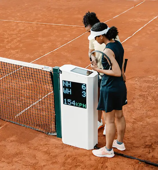
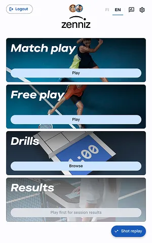
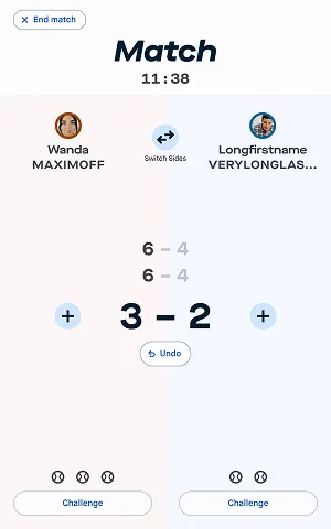
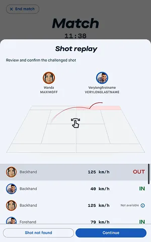
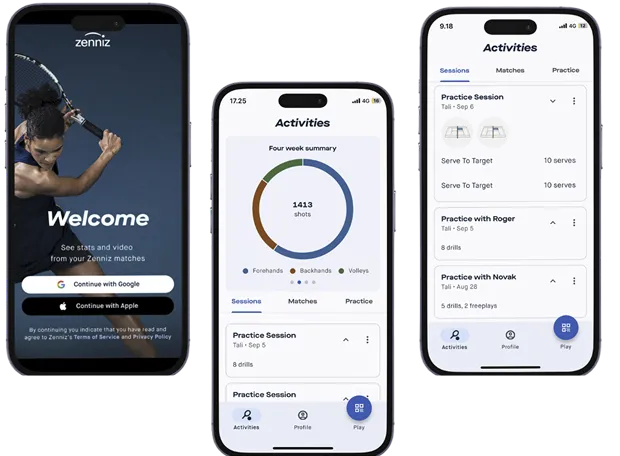
Zenniz had launched with agency-defined brand tokens and apps built for what existed, not what could come next. As UX Lead, I built a design system first, then used it to launch new products and audit existing ones — so the suite could grow without rebuilding.
Scalable design system
I built a centralized component library that became the source of truth — ensuring every product, new and old, spoke the same visual and interaction language.
New product design
As the product suite expanded, new apps needed to feel like part of the same family — not add-ons. Working within the established design system, I designed new apps that extended the suite without requiring users to relearn anything.
UX audit & optimisation
Tennis technology operates in demanding conditions — line-call devices used under direct sunlight by umpires tracking contested shots, telemetry dashboards opened on small phones immediately after a match. I audited all existing apps against these real environments and user types, making evidence-based changes that contributed to measurable reductions in user flow times and improved stickiness across the suite.
Designed for expansion
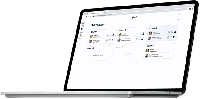
The suite was growing. Rather than designing each new product in isolation, I established patterns that future products could inherit — adaptable enough to accommodate a player's live scoring view, an umpire's decision interface, and a tournament manager's admin tools from the same component set. New product launches required no architectural rethink — the patterns absorbed every new user role without custom work.
Cohesive brand experience
With products for players, umpires, and academy managers, consistency across the suite was a user trust issue, not just aesthetics. One component library and one interaction language means every Zenniz product feels immediately familiar.
Active users
User stickiness
User flow times
“Jukka knows what he is doing and is able to quickly adapt to all kinds of design tasks — a great asset to development teams, fulfilling design needs, especially from a UX point of view.”
— Eero Kuusi, Co-founder & CEO at Zenniz
Shipping new features into a live marketplace
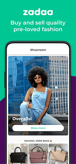
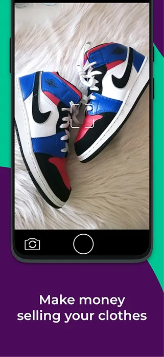
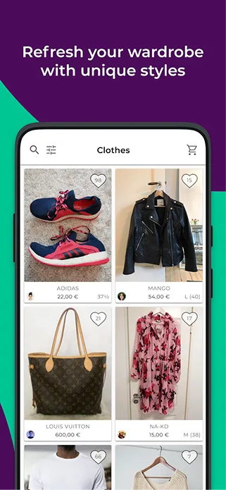
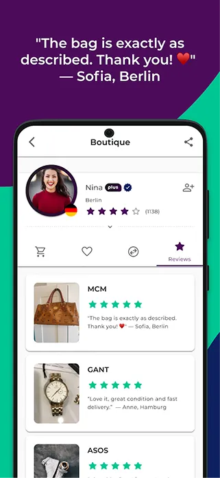
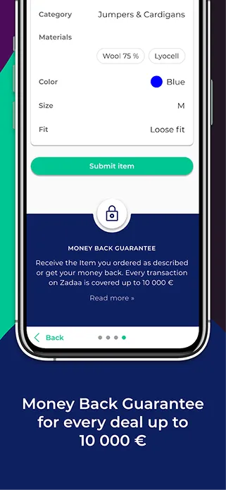
Permalink to this case study →Zadaa was already the customer-favourite in Finnish peer-to-peer fashion resale — over 500,000 users and 4+ stars on both app stores before I joined. The challenge wasn't fixing something broken; it was adding new capabilities without disrupting what loyal users already loved. As Lead Designer, I designed new features that slipped into existing flows rather than replacing them.
Research-driven
Zadaa had a history of involving power users in feature direction — the research culture was already there. My role was to make it rigorous: structuring research so insights confirmed or challenged assumptions before a pixel was pushed, not after. On a live product with 500,000 users, catching a wrong assumption in research cost hours; catching it after launch cost months.
Bidding, subscriptions & referral program
Bidding, subscriptions, and a referral program were new territory for Zadaa's users. Designing them end-to-end meant finding the right entry points in existing flows — so each new feature felt like it had always been there, not like a new section to learn.
Selling flow & search redesign
The selling flow and search UX had been built for an earlier, simpler product. With a growing catalogue and seller base, they needed work. I redesigned both to improve clarity and speed — keeping the interaction logic familiar so existing sellers didn't have to relearn.
Brand refresh
Launching Zadaa+ required a visual identity that could carry a new revenue model. I designed a refreshed Zadaa logo and a Zadaa+ sub-brand — keeping the existing brand equity intact while signalling that the product had grown beyond its original scope.
Native-feeling features
The Android app was originally a derivative of iOS. Nativizing it — aligning to Android patterns while fitting into Zadaa's existing experience — drove Google Play ratings from 4.1 to 4.6, surpassing iOS at 4.5. The principle throughout: every new feature plugged into an existing flow rather than requiring users to learn a new one.
App Store (Apple)
Google Play
“Jukka is a versatile designer with a strong orientation toward research-based development — eager to help others outside the traditional UI/UX scope.”
— Jyri Vähä-Pietilä, Co-Founder & Chief Hacking Officer at Zadaa
“Jukka has been one of the best performers — innovating and executing the needed UI/UX improvements which has led to a seamlessly flowing design.”
— Iiro Kormi, Co-Founder & CEO at Zadaa



Design leadership for a sensemaking platform
Permalink to this case study →Hunome started from a proof-of-concept built by the founders and a freelancer. When I joined as Chief Design Officer, the actual product was built from scratch. The core challenge: how do you design a simple interface for something inherently complex — dozens of people each holding partial knowledge of a topic from different angles, synthesized into one navigable view?
Design vision & strategy
Starting from scratch meant the design direction was mine to define. I set simplicity as the product's core design constraint — not aesthetic simplicity, but cognitive: the user should focus on making sense of complex topics, not on operating the tool. That principle carried through from the first wireframe to public launch — a product where usability and accessibility were built in, not bolted on.
Research & analytics
Analytics and user feedback weren't there on day one — we built the infrastructure as the product grew. I established a user-centric research process and, as the product matured, embedded an AARRR-based analytics dashboard that made growth patterns visible and actionable.
Team building
I built the design team from zero: recruiting and mentoring a graphic designer, a UX-frontend unicorn, and a UI trainee — alongside my own role as the generalist design-thinking lead. Different specializations, shared vision. Together we shipped Hunome from the ground up — concept to public launch and investor pitching.
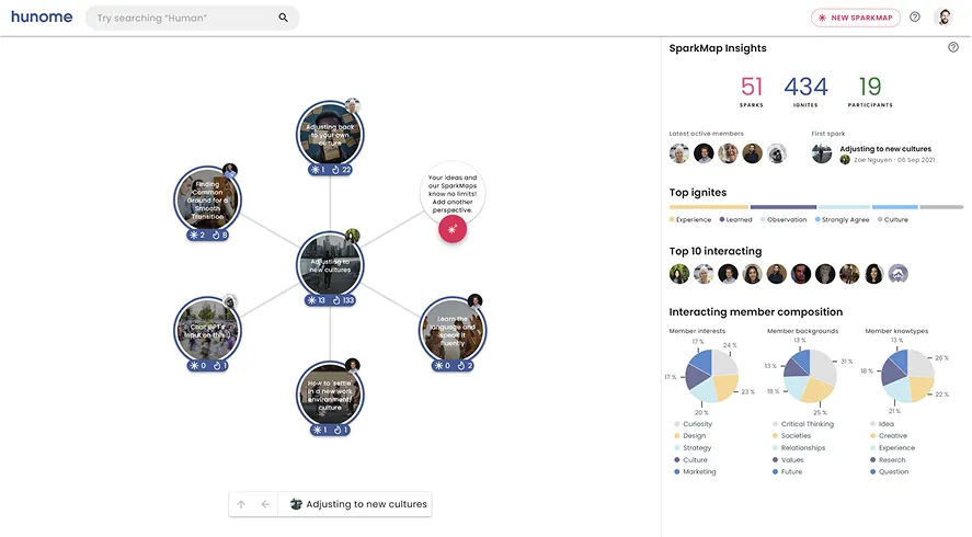
SparkMap knowledge maps
SparkMap had no direct design precedent. A news app shows a feed; Hunome needed to show a multiplayer mind-map — dozens of people's knowledge on a topic, from different angles, synthesized and explorable at once. I designed SparkMap to make those connections visible and navigable without overwhelming the user with the complexity behind them.
Structured sensemaking
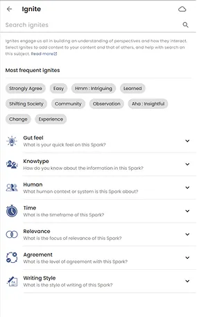
The hardest design problem in Hunome wasn't the data visualization — it was helping users do something meaningful with what they found. I designed curated content collections and guided reflection prompts to scaffold the move from information overload to informed perspective.
Unified design system
With web and mobile being built simultaneously from ground zero, I established a unified design system covering both surfaces. It gave the team a shared language, reduced design drift, and ensured every new feature had a consistent foundation to build from.
Concept to live product
Founders' PoC to public launch and investor pitching — built end-to-end, greenfield.
Design team built from scratch
Zero to four designers: generalist CDO, graphic, UX-frontend, UI.
Analytics & feedback loops embedded
AARRR dashboard embedded as the product matured, making growth patterns visible and actionable.
History in brief







“The clichéd work-related movie quote” — Wayne Gretzky & Michael Scott
Ye olde clients
Craft and taste that make any brand or style work.






























To be continued...?
Your project here